2021
Jobs.ie
Job Search & Learning Platform Redesign
About the product
Jobs.ie is a well-established online job search platform founded in Ireland over 17 years ago. Known for promoting trust and transparency in recruitment, the platform connects talented individuals with job opportunities and offers online learning resources to support career growth.
My role
UX Designer. As part of a UX Bootcamp project, I was responsible for analyzing the existing platform, identifying usability issues, and proposing a redesigned user experience focused on clarity, simplicity, and engagement.
Main project goal
Restructure and simplify the registration and job search experience to reduce cognitive load, improve visual clarity, and highlight underutilized features such as educational content and the mobile app.
Discovery
Background
New users primarily interacted with the site through the job search bar, often leaving shortly after. There was minimal visibility for courses and learning tools, and the visual design failed to create a compelling experience that invited deeper exploration.
Challenge
Modernize the visual aspect of the Modernize the visual identity of the platform.
Streamline the user experience, especially for registration and job applications.
Create a more engaging experience that promotes other features beyond job search.
Goals and objectives
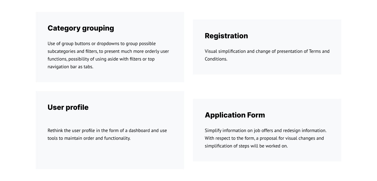
Simplify the registration and profile creation process.
Redesign filters, results, and job application screens to reduce information overload.
Propose visual enhancements and reorganize site elements to improve content discovery.
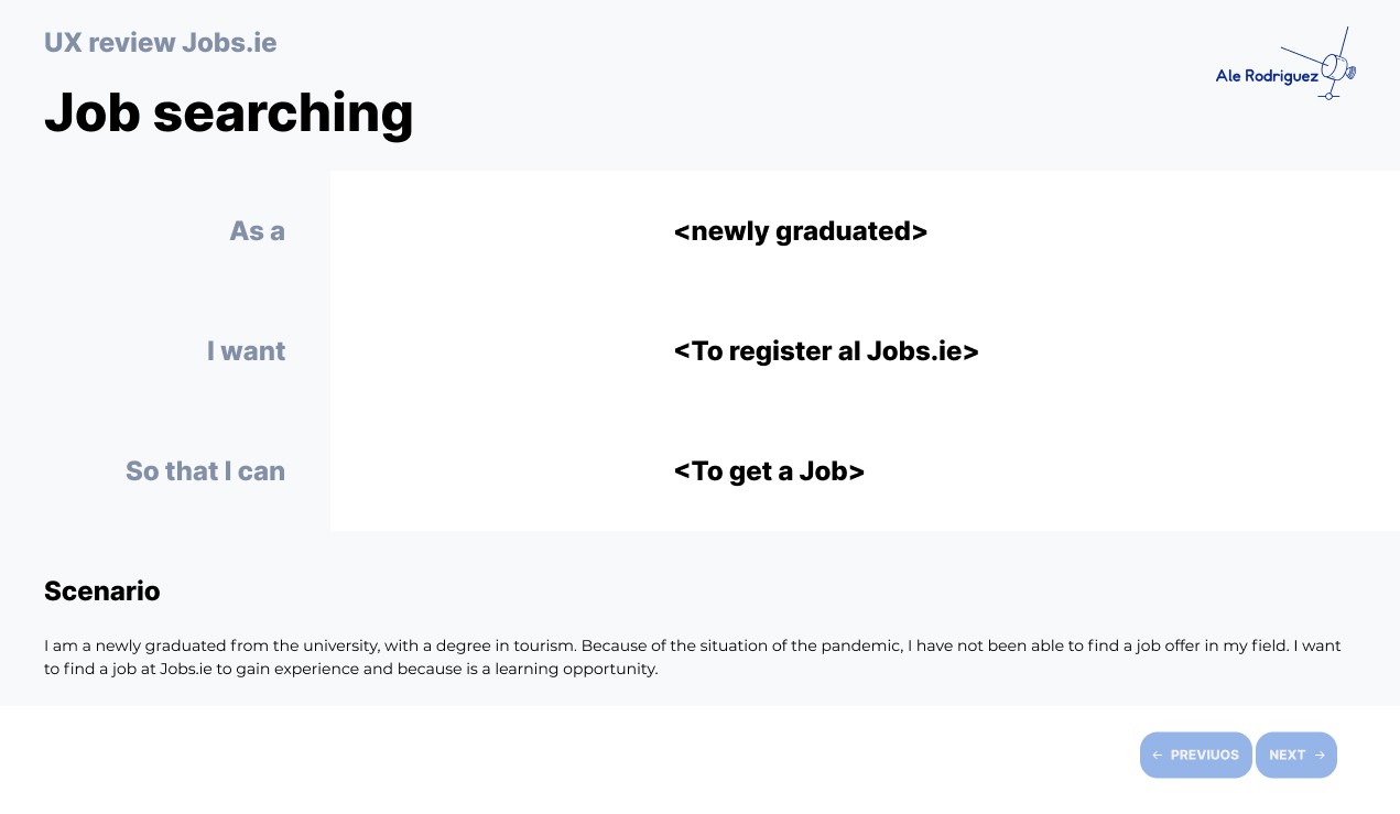
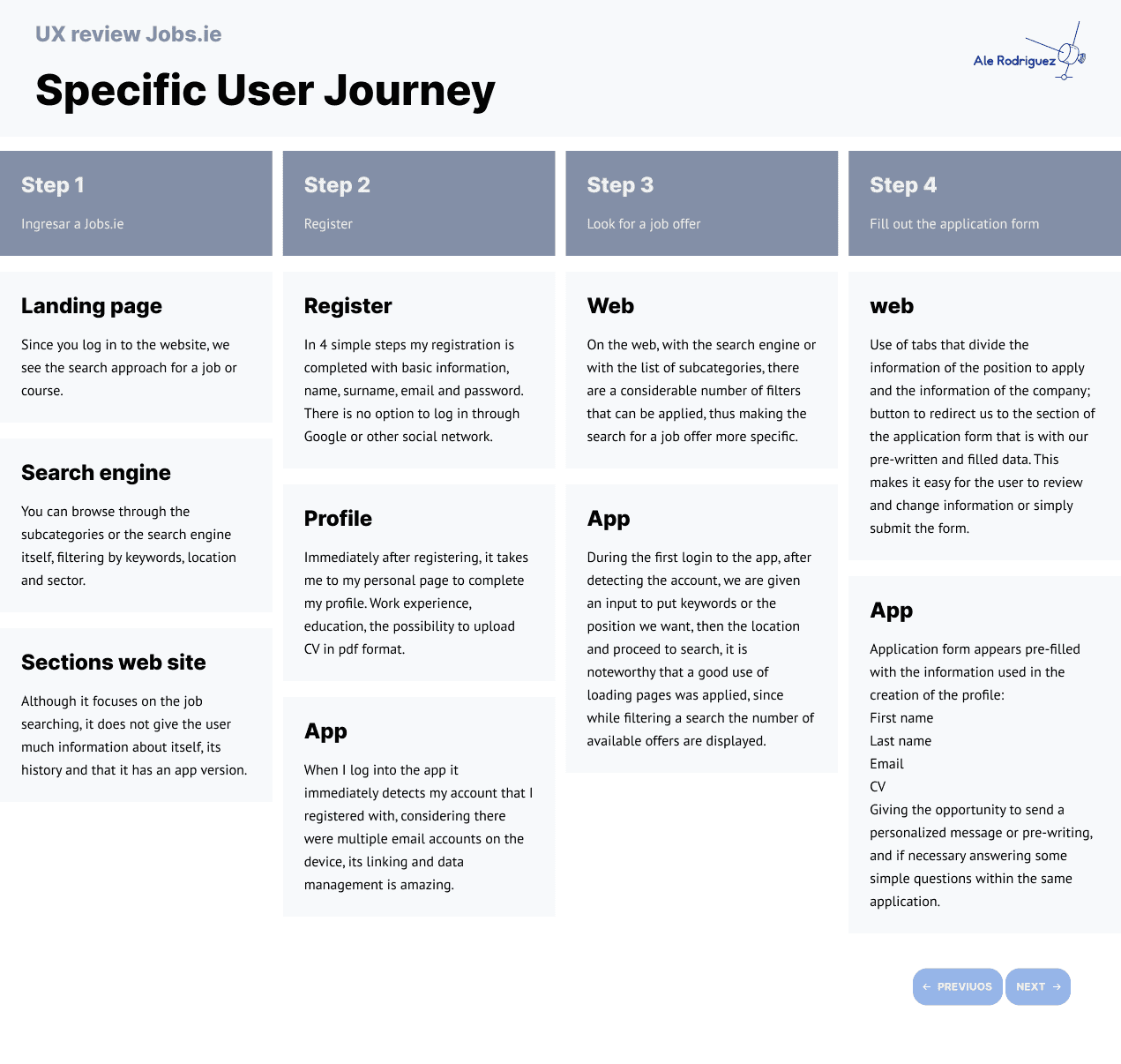
User Story
To better understand the experience, I assumed the role of a recently graduated student searching for a first job. I navigated the platform, mapped the user journey, identified pain points, and analyzed how competing platforms solved similar problems.
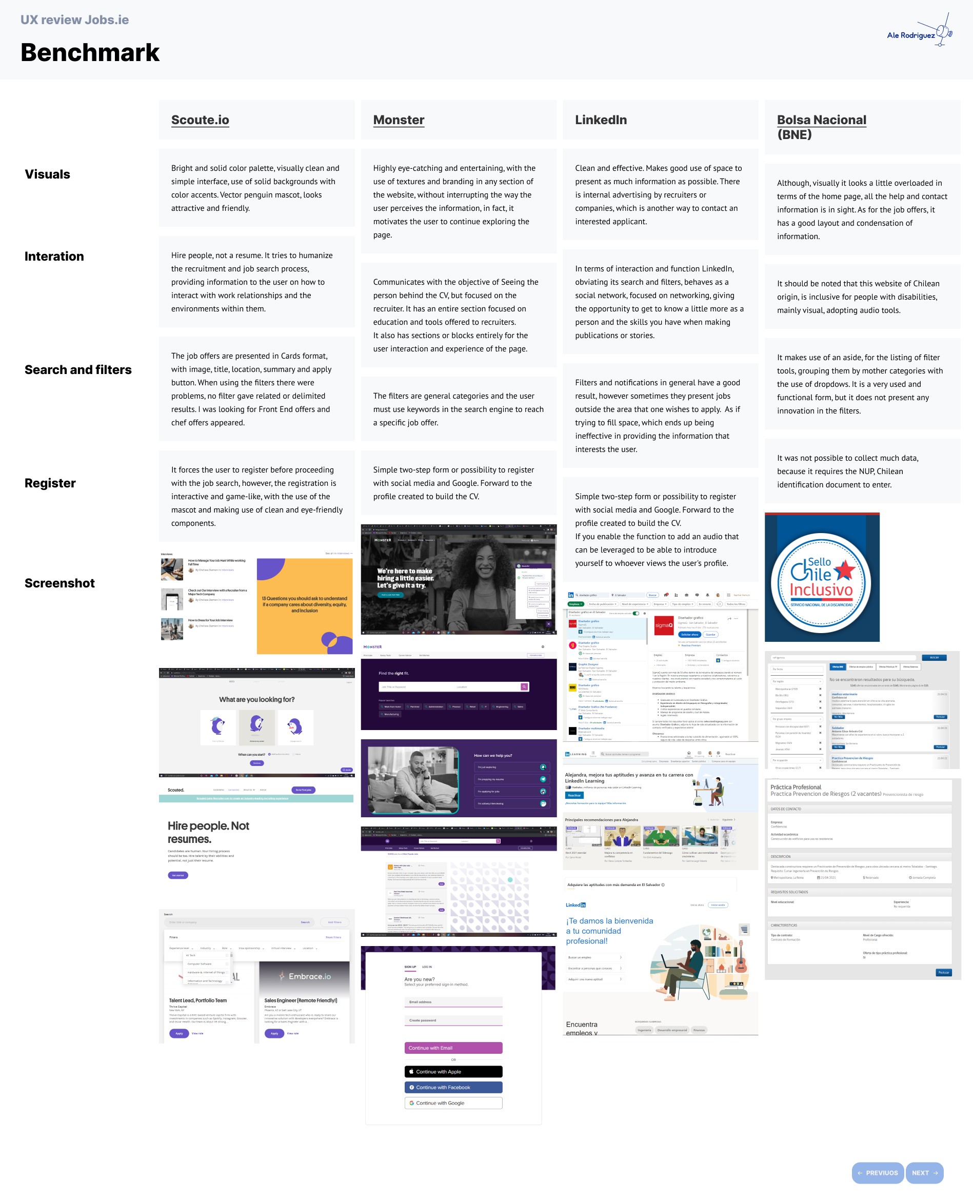
Benchmark
I conducted a competitive analysis of similar job search platforms including Scout.io, Monster, LinkedIn, and Bolsa Nacional de Empleo (BNE).
Key takeaways for Jobs.ie:
Many competitors humanize the job-hunting process through storytelling or clearer employer branding.
Content hierarchy and simplified layouts helped reduce friction.
Personalized touches (recommendations, saved searches, etc.) increased user retention.
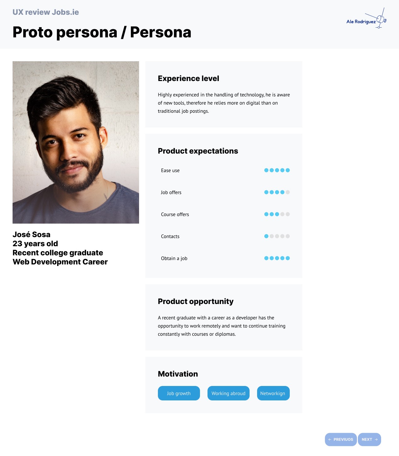
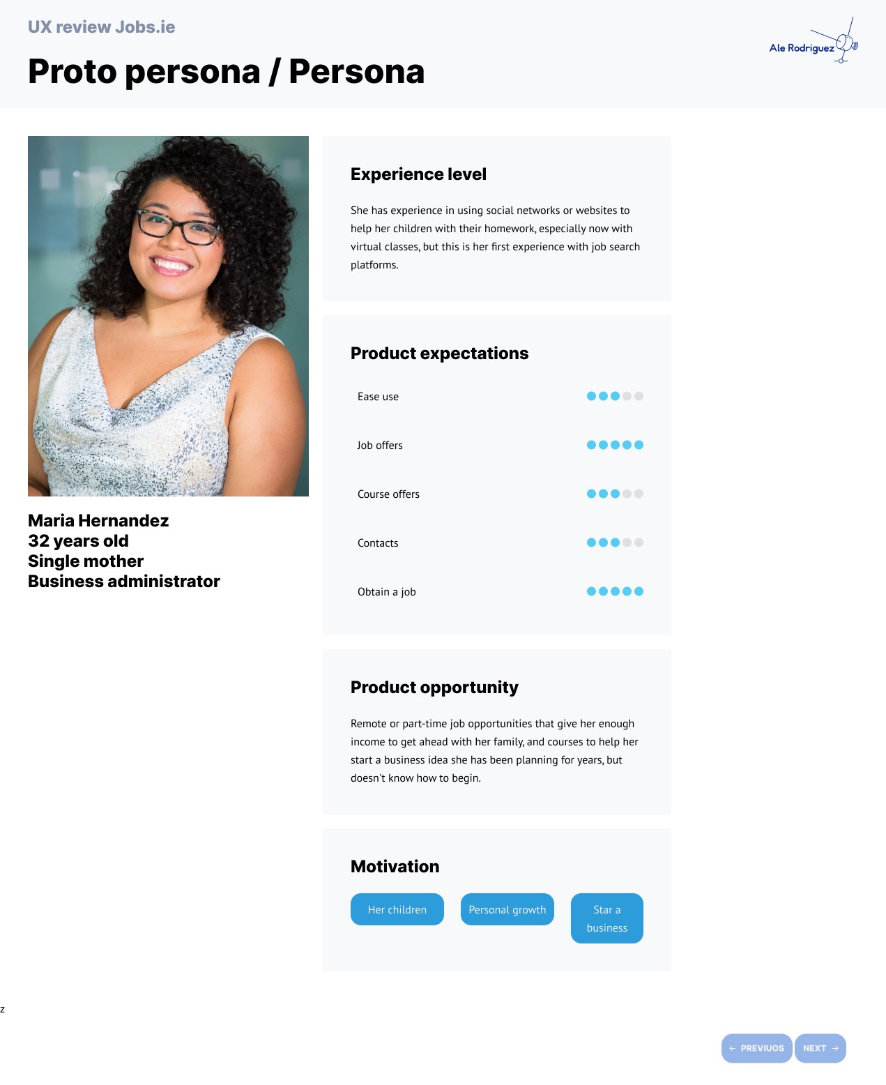
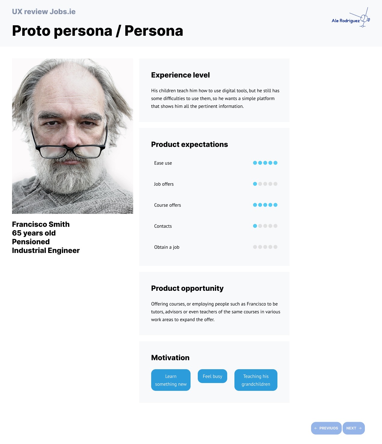
User personas
I created user persona profiles for the differente groups that use the platform:
23 year old University graduate
32 years olf Single mother seeking to return to working life
65 years old Pensioned man looking to learn new skills
Problem definition
Despite being widely recognized, Jobs.ie faced a lack of engagement from new users beyond the basic job search. The platform’s learning resources were hidden, its visual hierarchy was weak, and promotional elements such as the mobile app banner went mostly unnoticed. Users reported a lack of incentive to explore further due to overwhelming text, outdated visuals, and a complicated user journey.
Scoping
From research and benchmarking, I identified key insights to improve Jobs.ie:
Excellent autofill/data management already in place.
The platform needed more human-centered interaction.
Content hierarchy was lacking, making navigation harder.
Filters needed grouping and better labeling to reduce fatigue.
Search results should only show the most relevant details up front.
Better section differentiation was needed to highlight the site's full range of offerings.
I defined the following core modules for redesign:
Onboarding & Registration
Job Search Filters
Job Results
Profile & Learning Tools
Promotional Elements (e.g. App banner)
Solution design
Design sprint
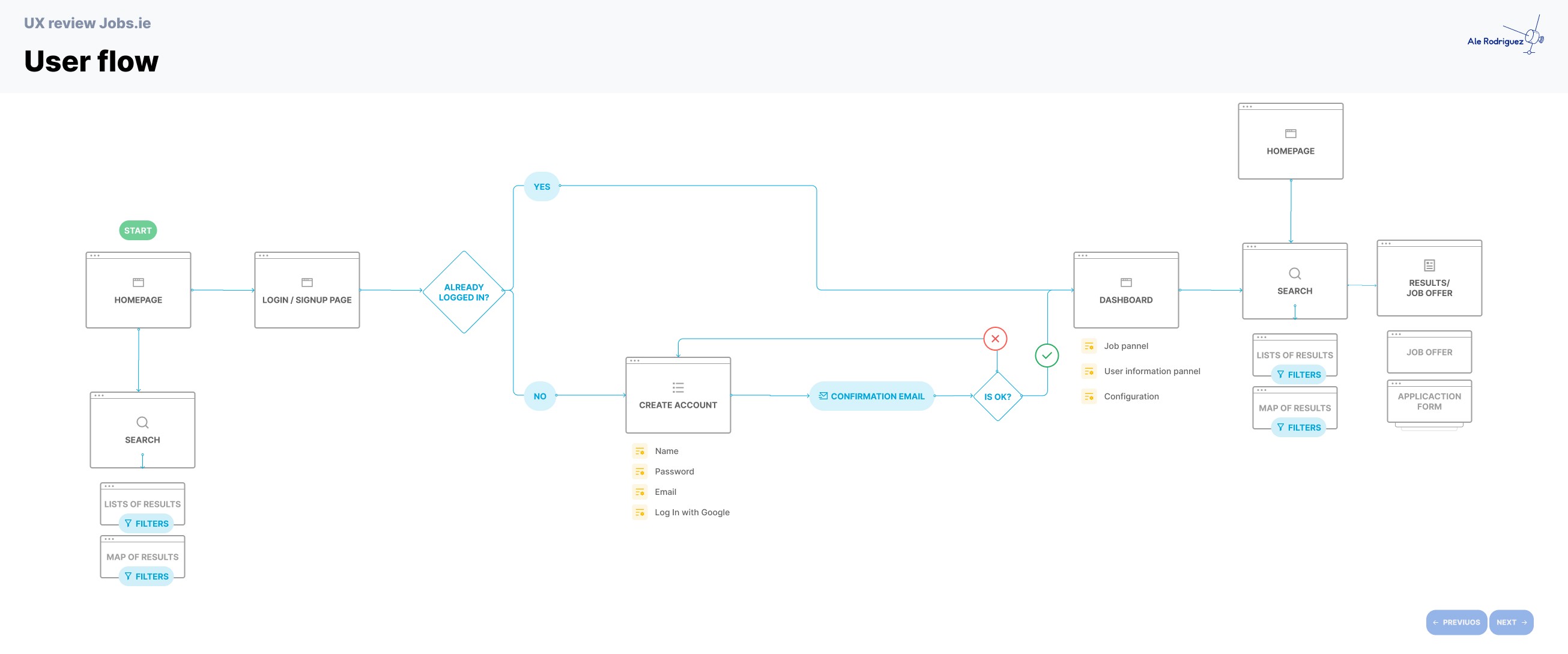
I initiated the design process with a restructured user flow aimed at reducing steps and eliminating redundancy.
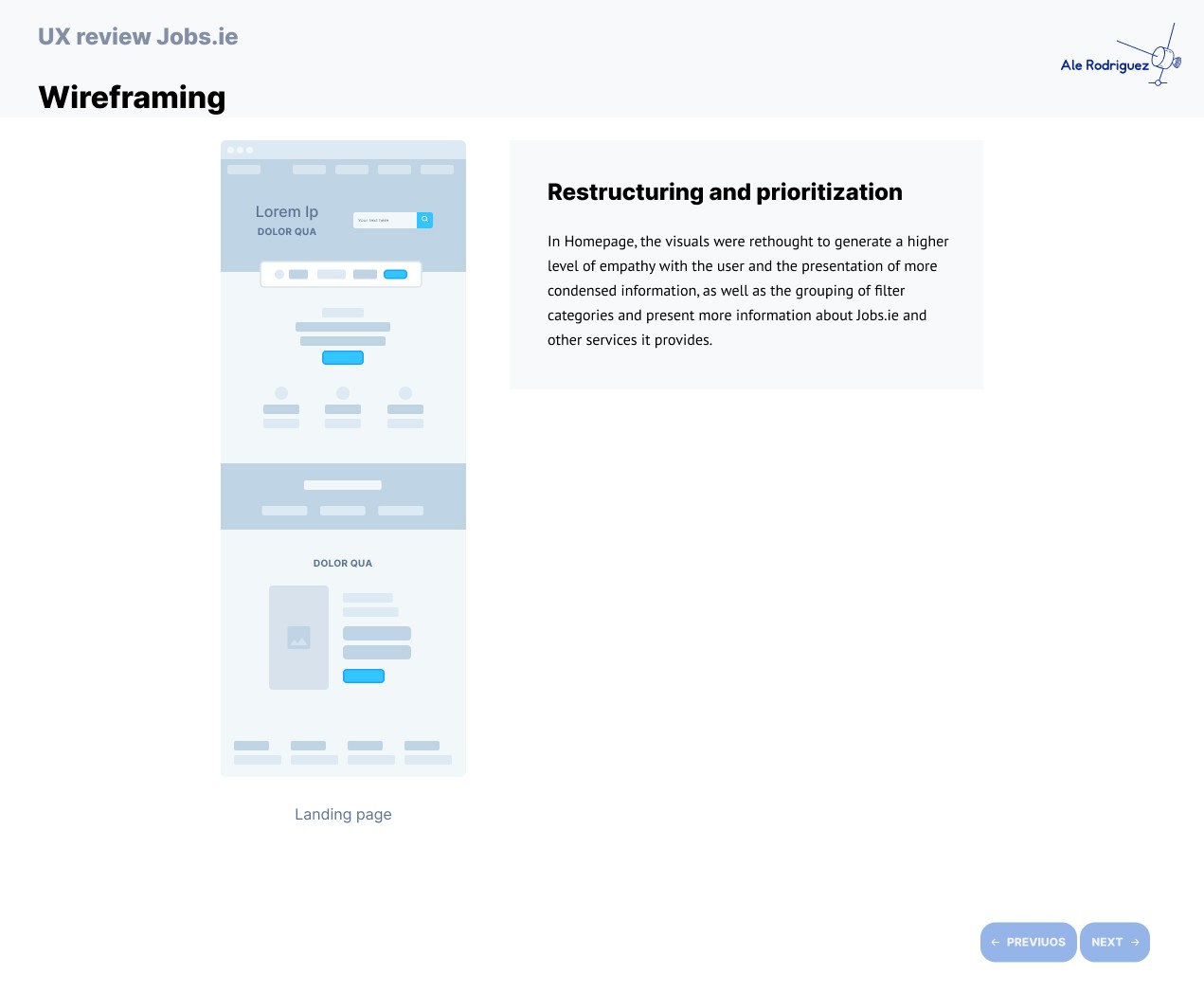
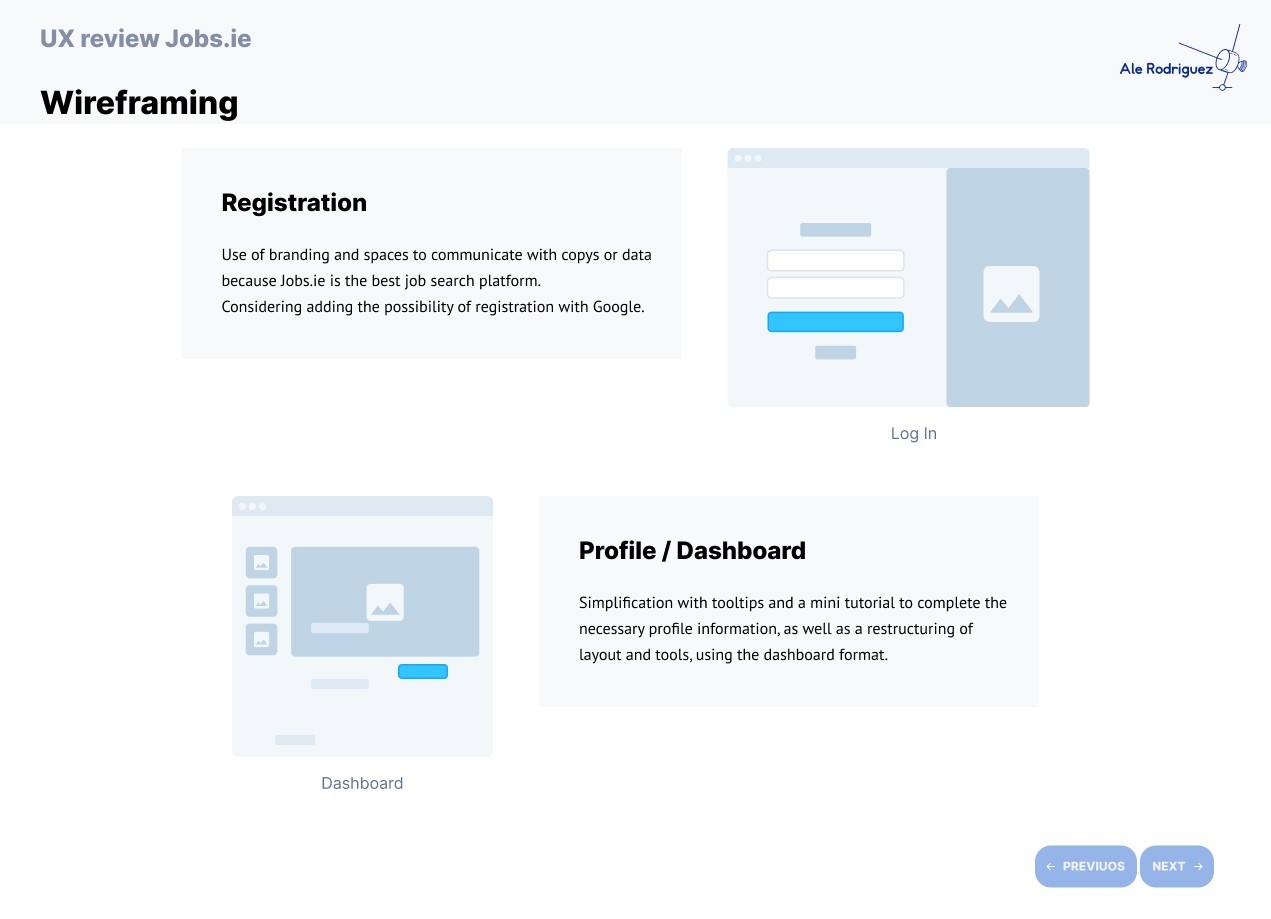
Wireframing
I created low-fidelity wireframes to test layout and content hierarchy. The focus was on making navigation intuitive and ensuring the structure guided users toward deeper engagement with the platform.
Execution
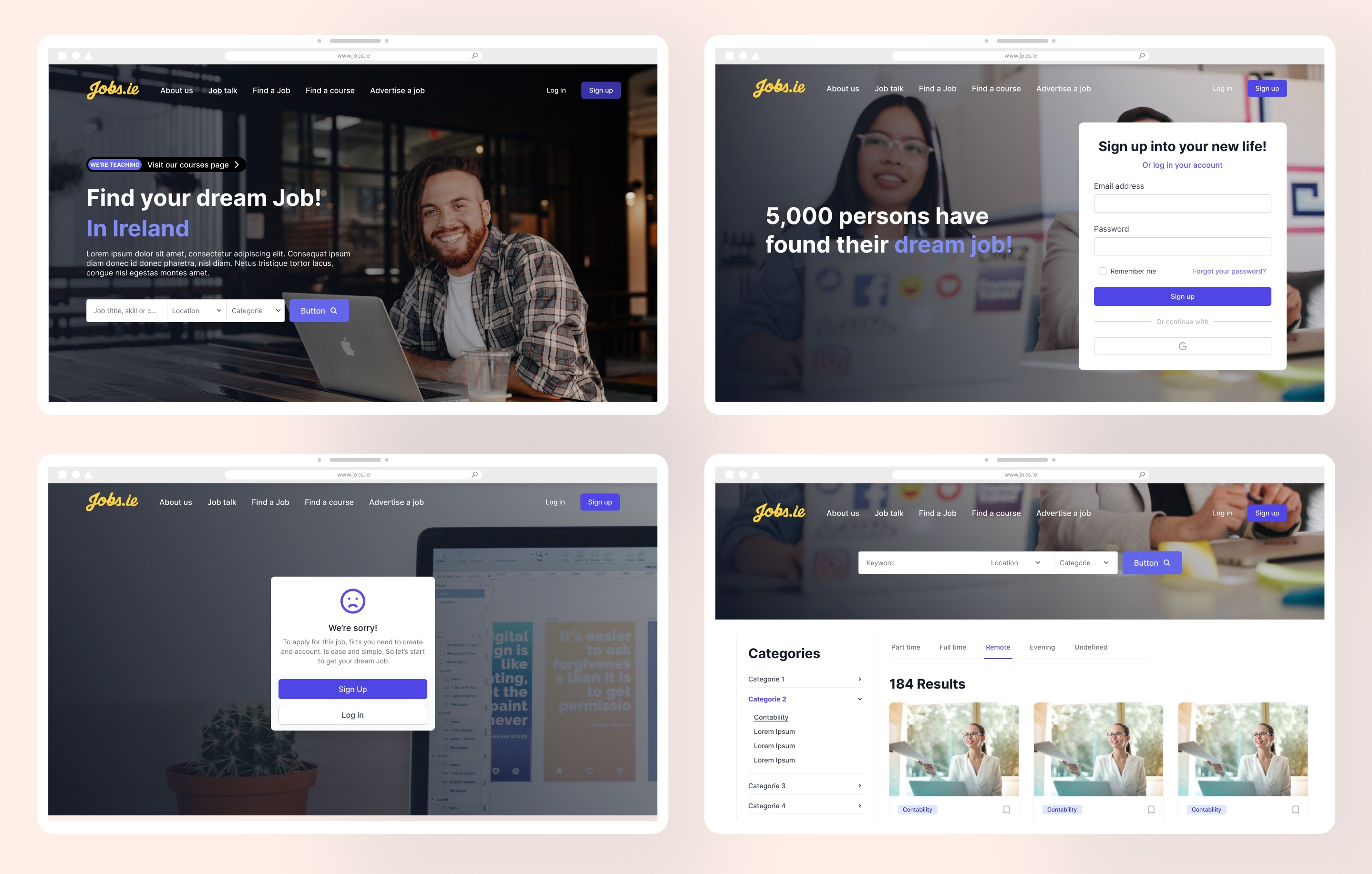
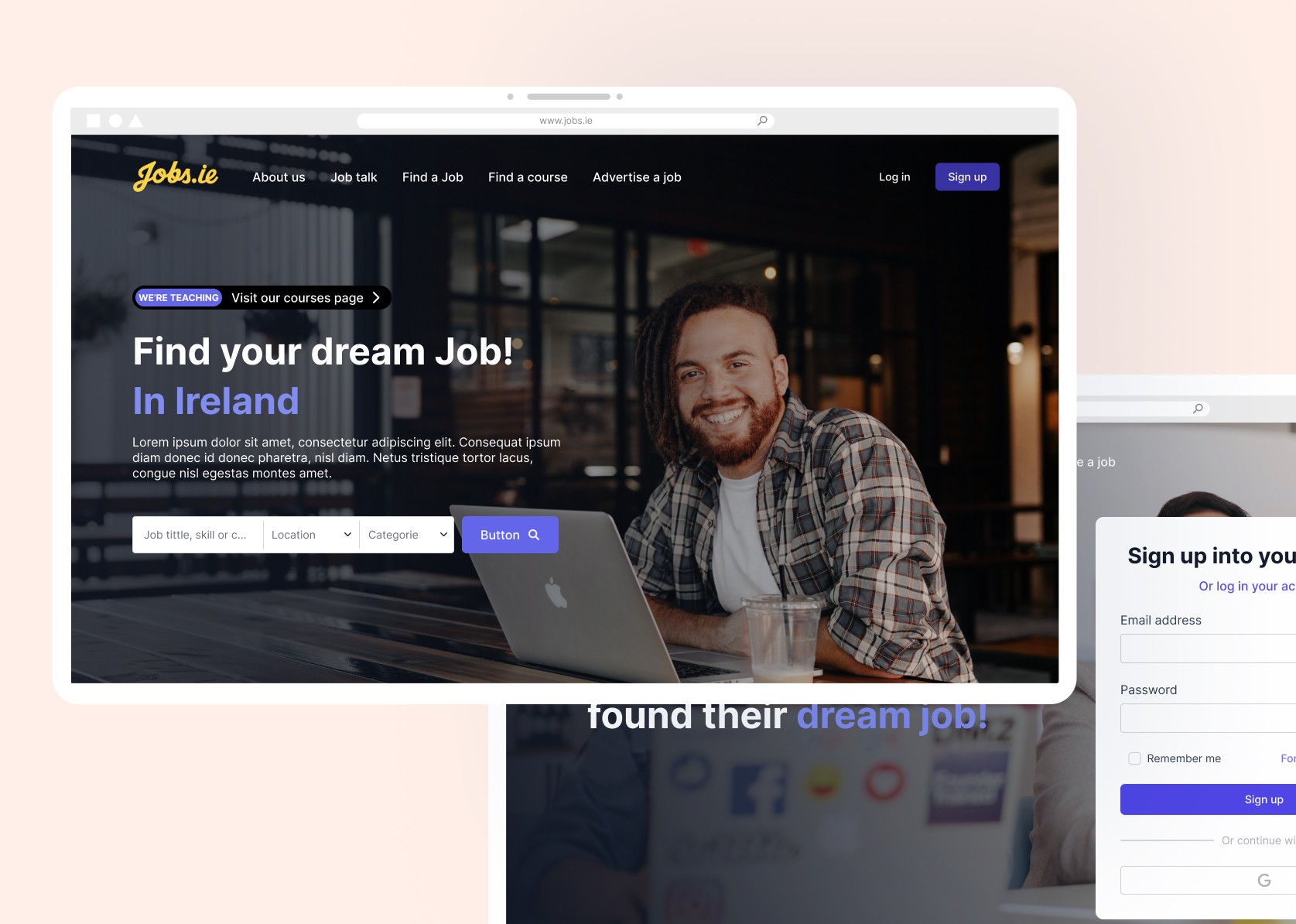
High-Fidelity Screens
Based on testing and iteration, I produced high-fidelity mockups with:
A clean and modern visual style
Improved layout clarity and spacing
Reorganized filters grouped by relevance
Highlighted course offerings and promotional banners
Clearer application steps for job listings