2021
Bajo Cero
Molecular Ice Cream App
About the product
Bajo Cero is a molecular ice cream brand that aimed to transition from a physical storefront to a direct-to-consumer digital experience through a mobile e-commerce app.
My role
Lead UI/UX Designer
I led the design process end-to-end, from user research and experience definition to UI design and final prototypes. I also supported marketing initiatives through email campaign design.
Main project goal
Create a fully personalized buying and selling experience through a mobile app that makes each purchase feel tailored to the user, helping the brand position itself as an exclusive, modern ice cream option.
Discovery
Background
Bajo Cero sought to reduce operational costs by transitioning from physical retail to an exclusive online business model. The goal was to offer a fully branded e-commerce experience and eliminate dependency on third-party apps.
Challenge
Transform a brick-and-mortar business into an independent digital commerce platform.
Compete in a space already occupied by large delivery apps and established ice cream brands.
Create a user experience that appeals to digital-native users and highlights Bajo Cero’s uniqueness.
Goals and objectives
Introduce the brand to the e-commerce and delivery market.
Control the entire purchase process without relying on external platforms.
Establish a memorable, exclusive user experience that sets the brand apart in the minds of consumers.
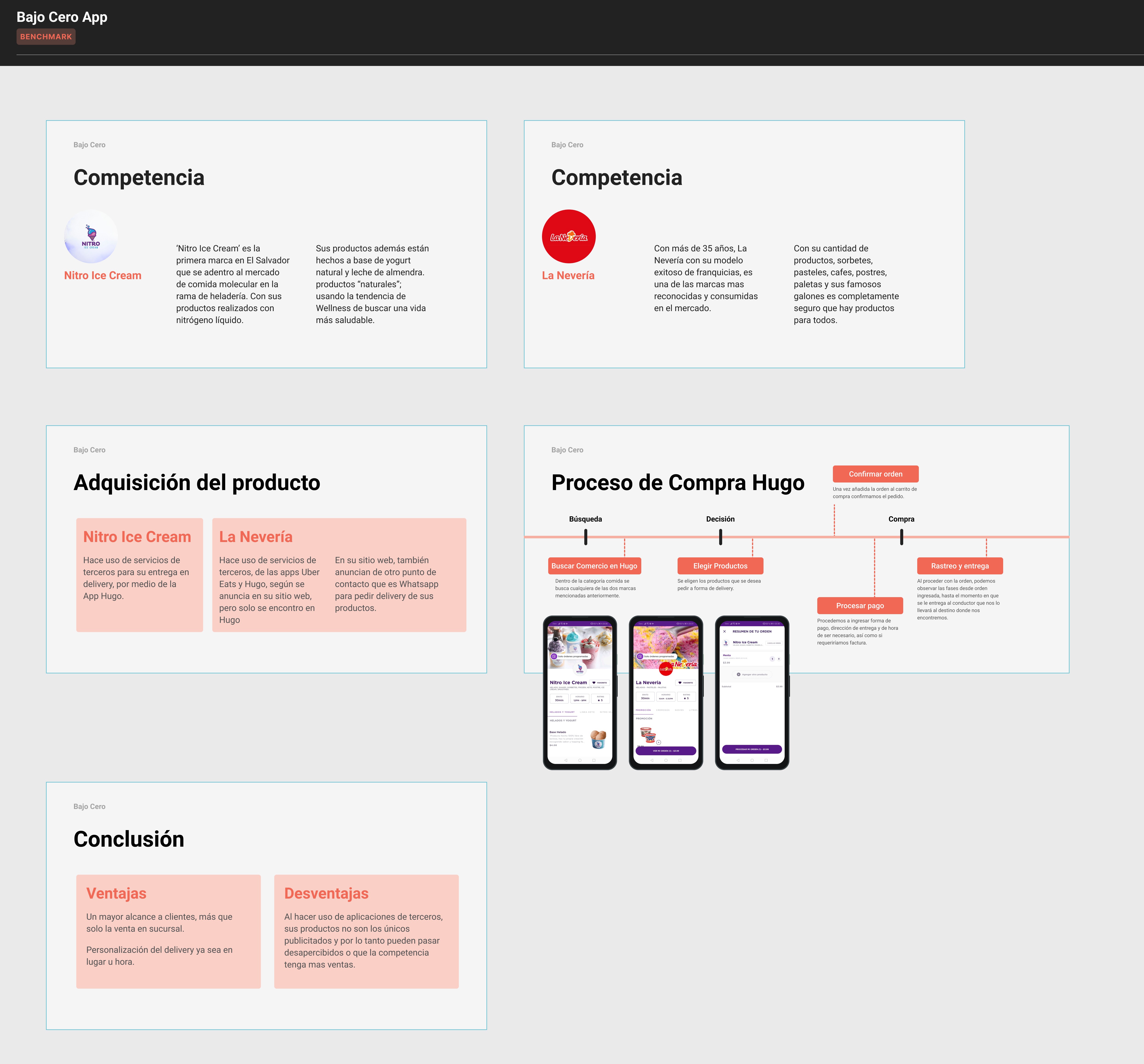
Benchmark
We analyzed major competitors such as Nitro Ice Cream and La Nevería, as well as delivery-focused apps like Hugo.
Key takeaways:
Using third-party platforms can increase reach but reduces brand visibility and control.
Consumers value personalization, clear pricing, and reliable delivery status updates.
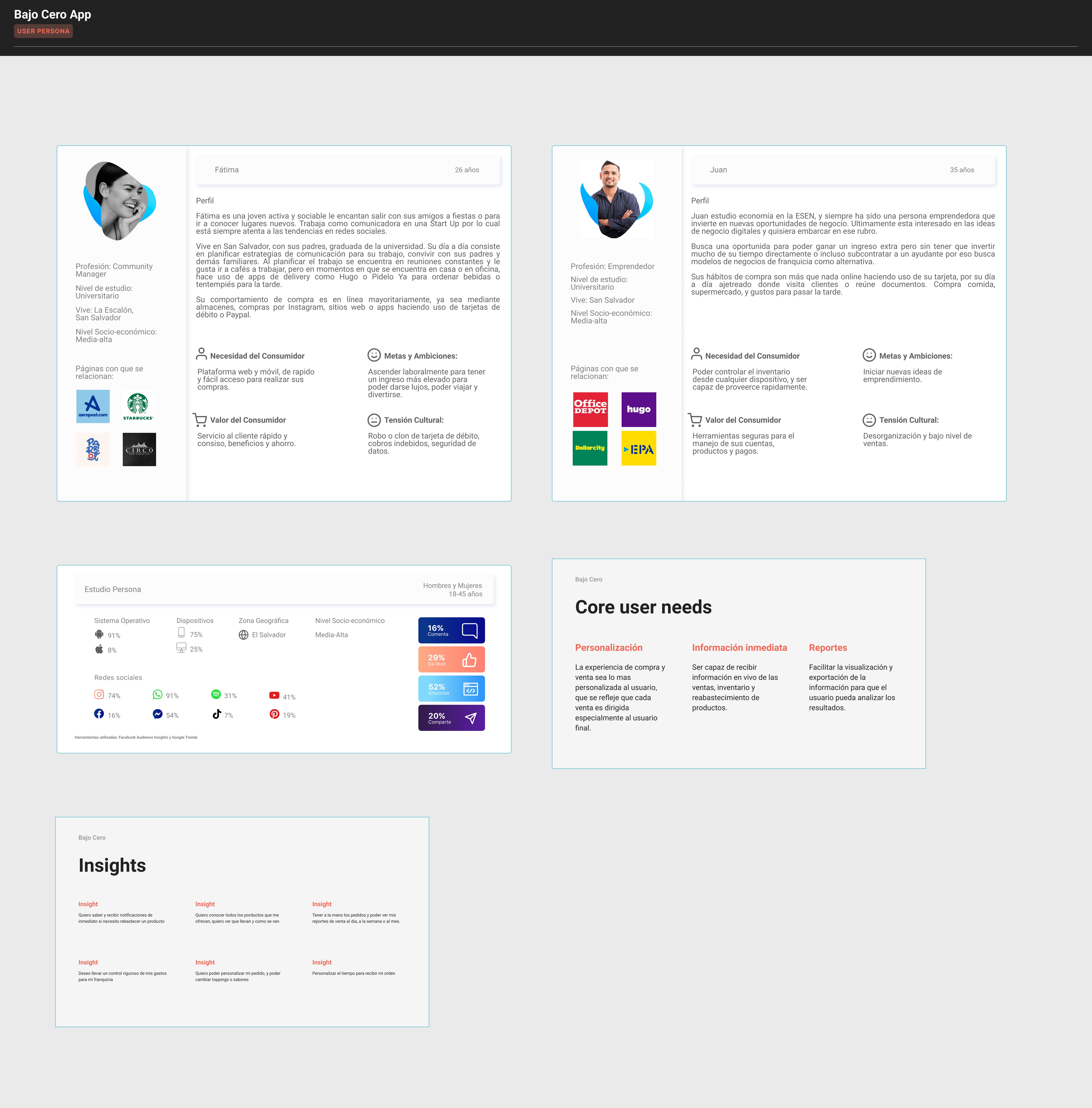
User personas
We created personas based on our research and benchmark insights, focusing on:
The desire for product customization.
Access to real-time order updates.
Frustration with hidden fees.
Preference for a clean, visual interface.
Scoping
Through internal workshops and early sketching, we defined:
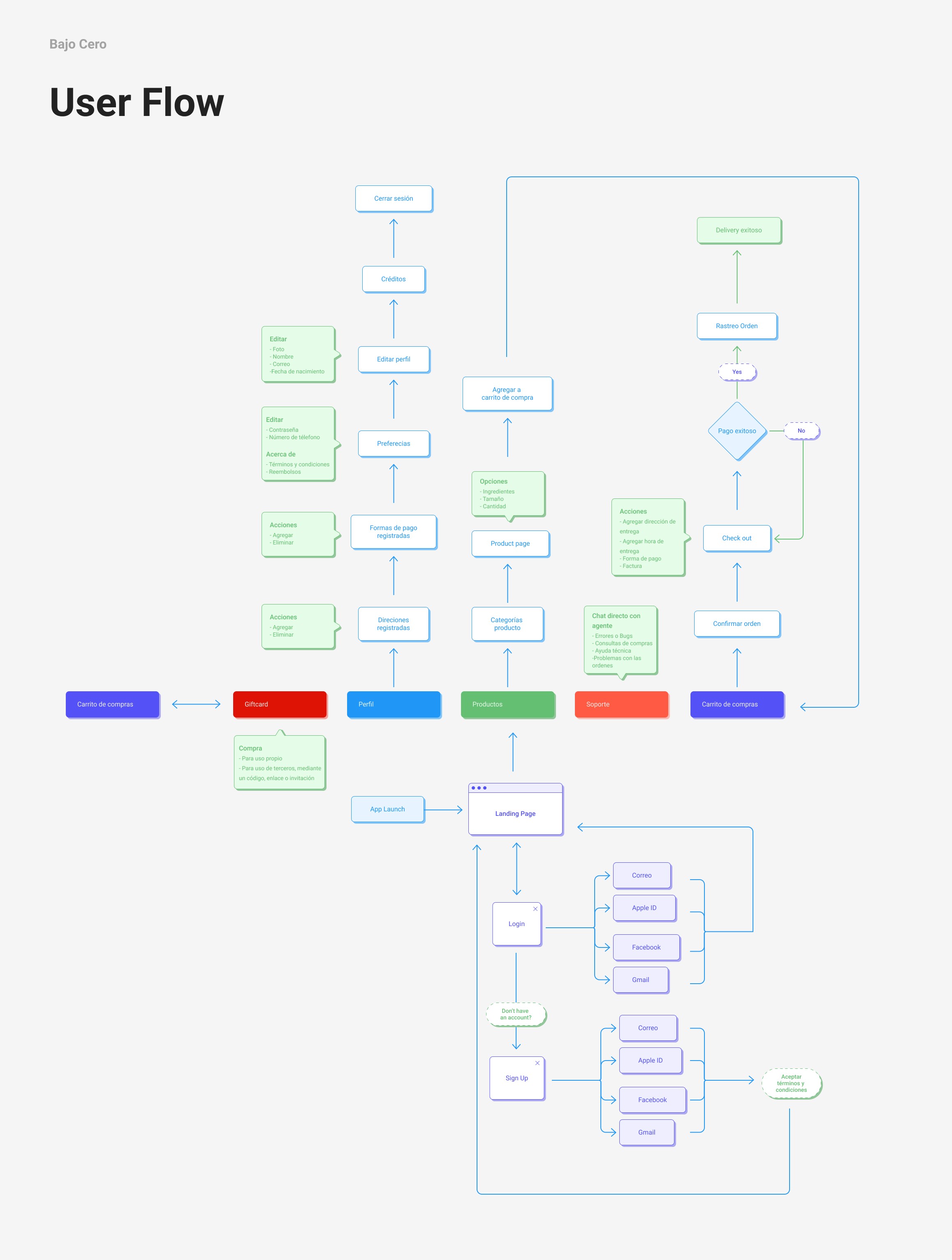
The user flow map.
App architecture and main sections.
A dynamic promotional banner feature within the app for special offers.
Problem definition
Bajo Cero was operating exclusively as an on-site business. While it had a loyal local customer base, it struggled with rising operational costs and limited reach. The company needed to pivot to an e-commerce strategy to stay competitive, improve efficiency, and increase market visibility. However, using third-party delivery platforms diluted brand presence and control over the customer experience.
We were tasked with designing a standalone, branded app that could:
Deliver a highly personalized experience.
Reflect the premium nature of the product.
Give Bajo Cero full control over its sales process, delivery logistics, and brand communication.
Solution design
Design sprint
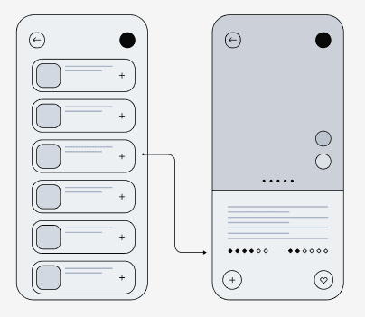
Option 1
An animated and playful layout, focused on visual delight and brand personality.

Option 2
A more modular and structured UI, prioritizing product imagery and easier development.
Prototype
Based on feedback from stakeholders and developers, I proposed a hybrid approach—modular design with engaging visual elements—to ensure quick implementation and strong user appeal.
Usability test
We conducted moderated testing with six users from our target personas to evaluate:
App navigation and icon clarity.
Reception of product visuals and layout.
Desire for deeper customization options.
Key insights:
Users easily understood the icons and app navigation.
Custom add-ons and toppings were a must-have.
Visual design was appealing but needed more emphasis on key elements.
Execution
Motion Graphics
To enhance visual engagement and create a premium feel, we introduced subtle motion in UI components based on user feedback.
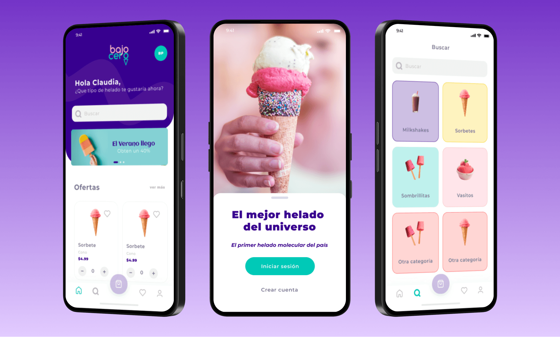
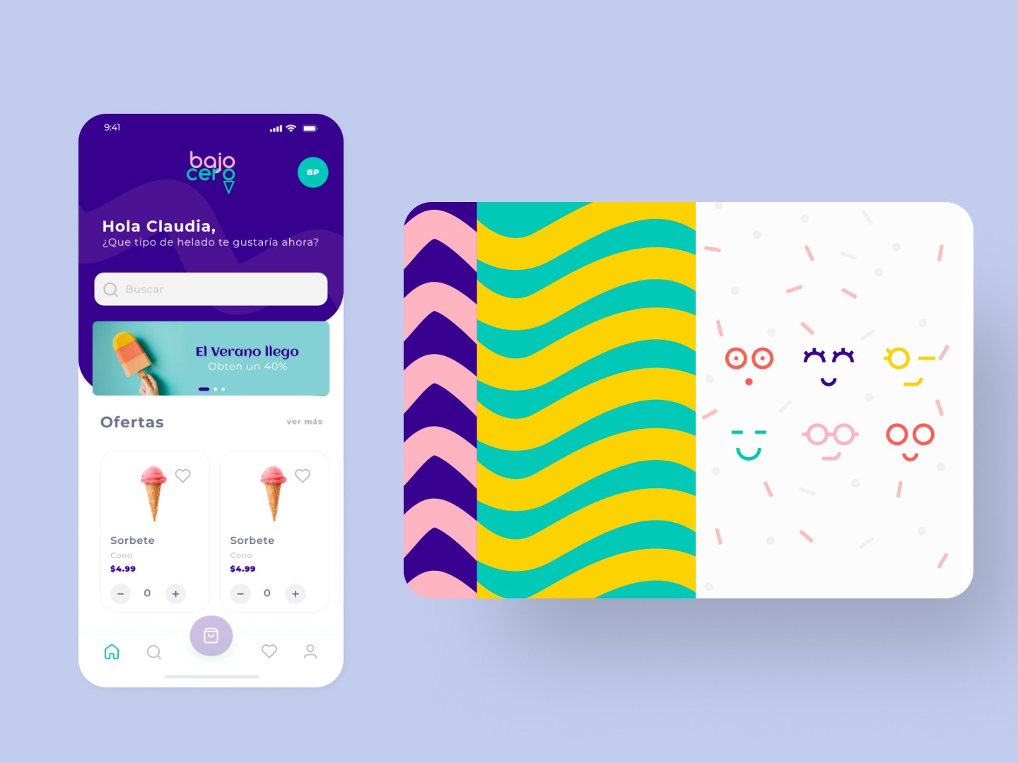
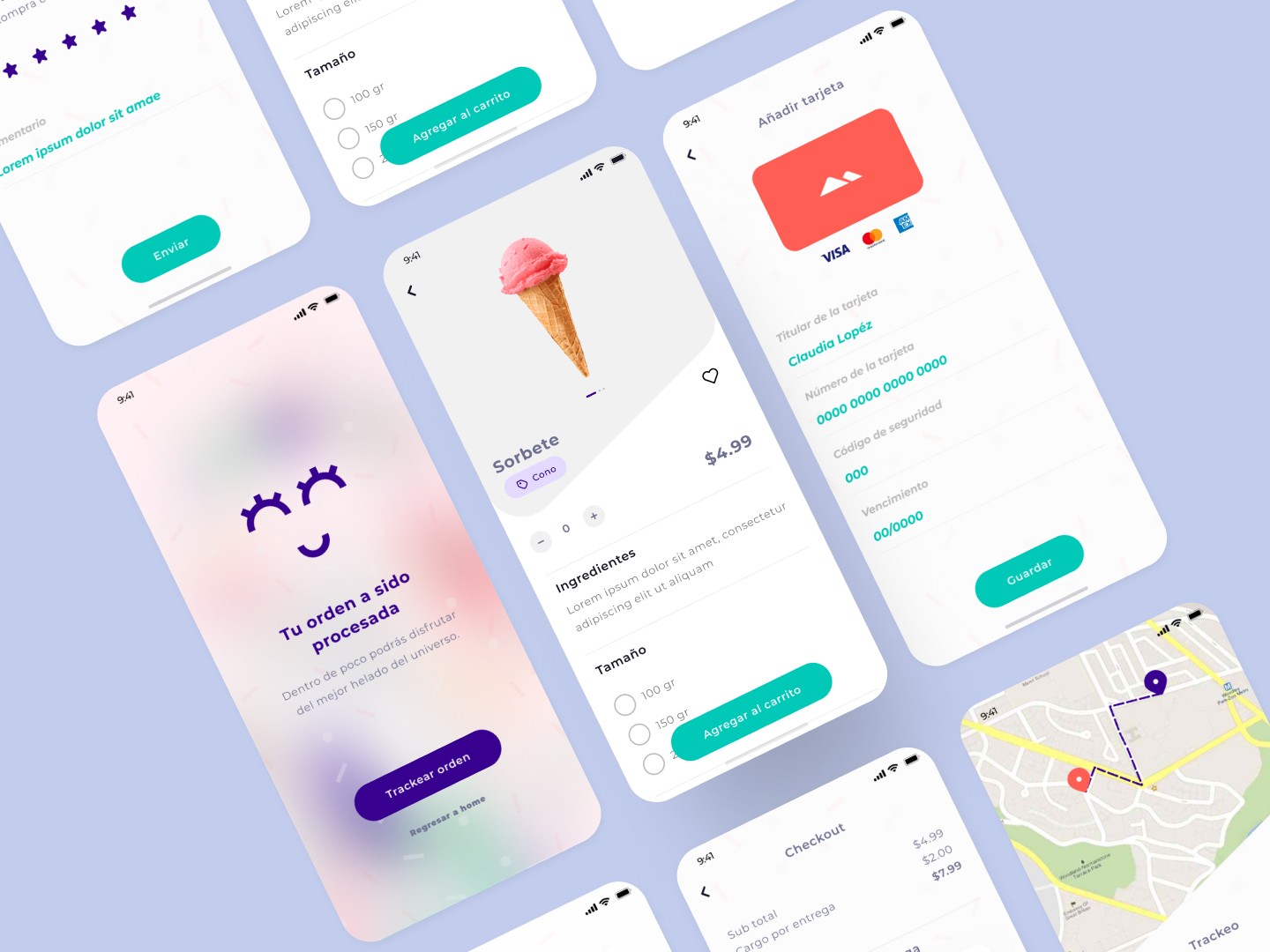
Final designs
We iterated the app based on testing insights and finalized a clean, modular, and engaging shopping experience tailored to the target audience.
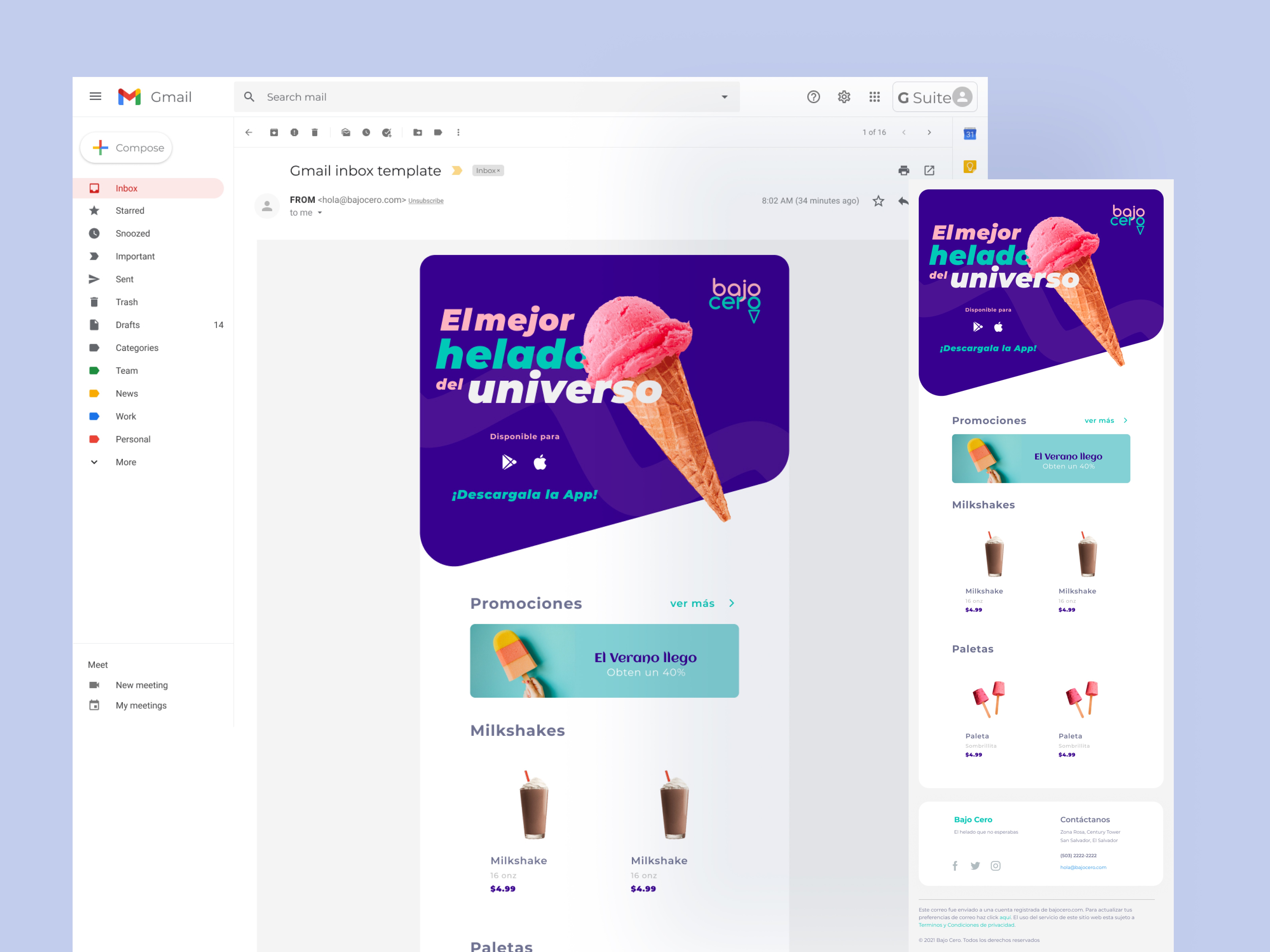
Newsletter Design
I also contributed to the e-mail marketing strategy, designing visually cohesive newsletters aligned with the app branding to increase user retention and engagement.