2020-2021
IVoting
Digital Voting Registration Platform
About the product
IVoting is a web and mobile-based system developed to manage ballot registration for Chile’s national elections in 2021. The platform aimed to streamline voter tracking and attendance reporting at a national level.
My role
Product Designer & UX Researcher | Lead UI/UX Designer (Freelance at GeSoftCorp)
Main project goal
Design and implement a centralized, user-friendly digital system that had to be scalable, intuitive, and accessible for users with varying tech skills—from local volunteers to government analysts.
Discovery
Background
For the 2021 Chilean presidential elections, a new solution was required to digitize and optimize voting registration. The system had to be interoperable, secure, and intuitive — suitable for both government agencies and field volunteers.
Challenge
Build the product from scratch.
Design for multiple user roles, each with distinct needs and permissions.
Ensure national scalability and interoperability across cities and regions.
Goals and objectives
Optimize the registration process of voters and attendee tracking by zone.
Create an intuitive, accessible system for users with different roles (volunteers, admins, government officials).
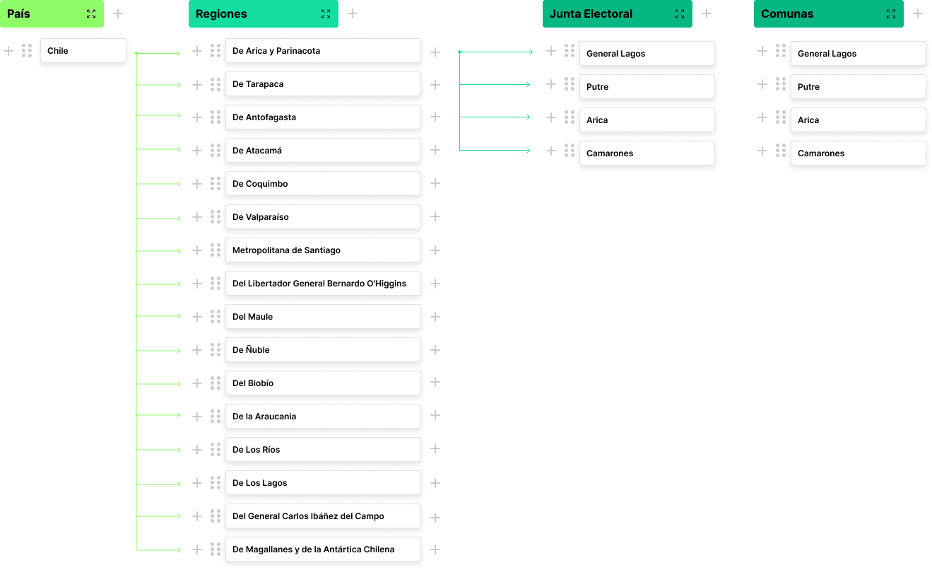
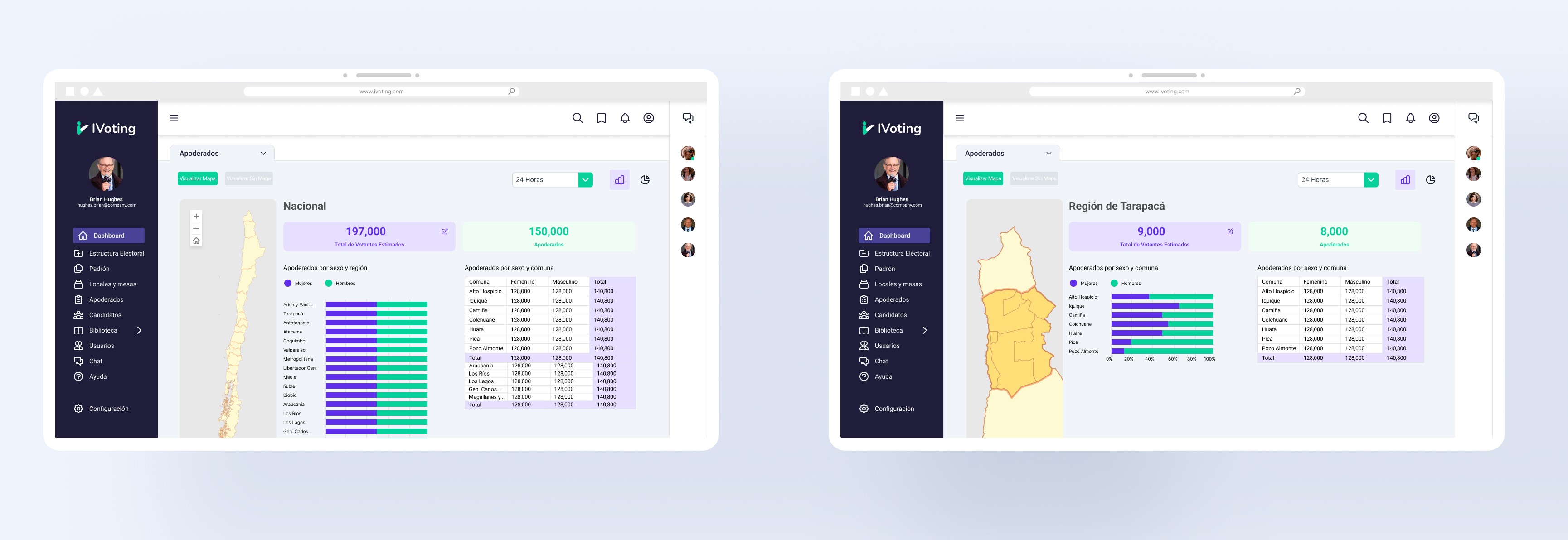
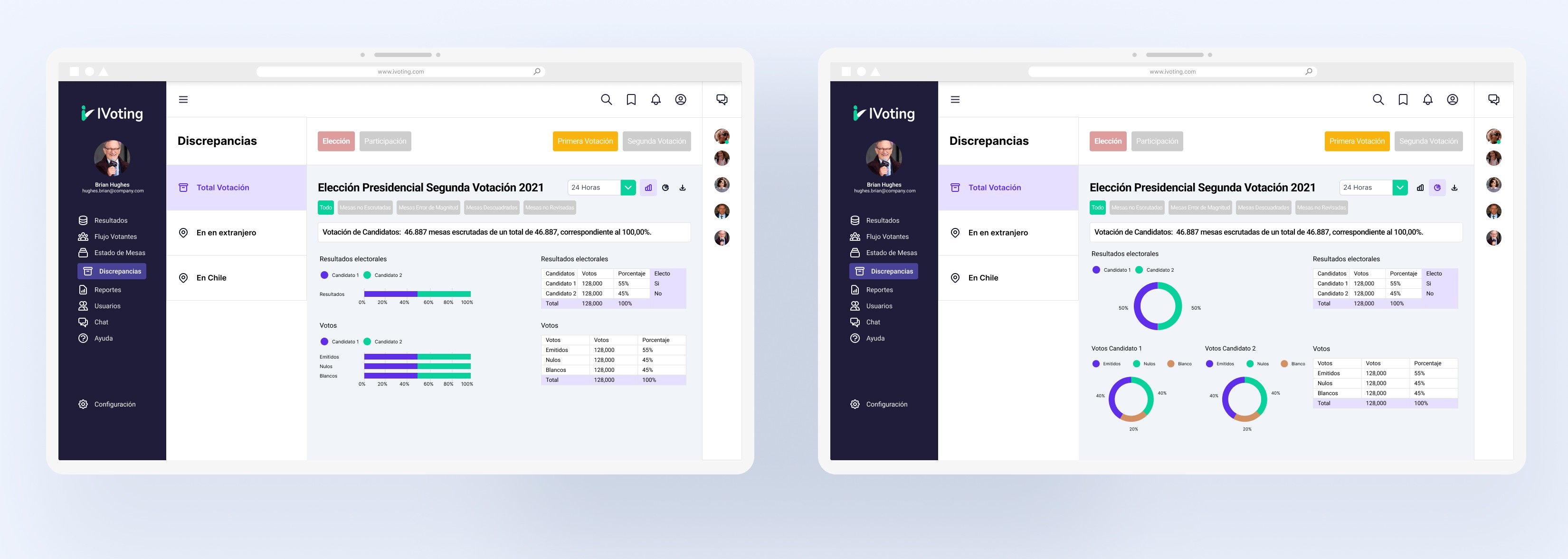
Integrate data visualization through Power BI for real-time analytics and decision-making.
Simplify the learning curve for volunteers with minimal onboarding.
Workshop
We participated in workshops with the development, research and government officials to streamline the process, structure the information and establish the scoping.
Problem definition
Problem definition
During the 2017 Chilean elections, voting registration was handled manually or through fragmented digital tools. This caused delays, human errors, and limited visibility for real-time decision-making by government authorities and local coordinators.
There was no centralized system to:
Track who had voted in each region
Visualize real-time participation data
Coordinate volunteers across thousands of voting stations
Scoping
We identified the need to split the product into three interconnected platforms:
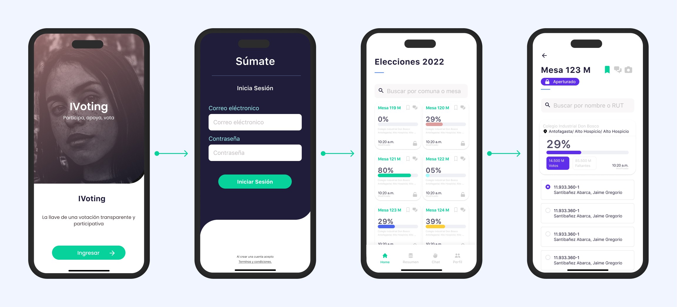
Volunteer App
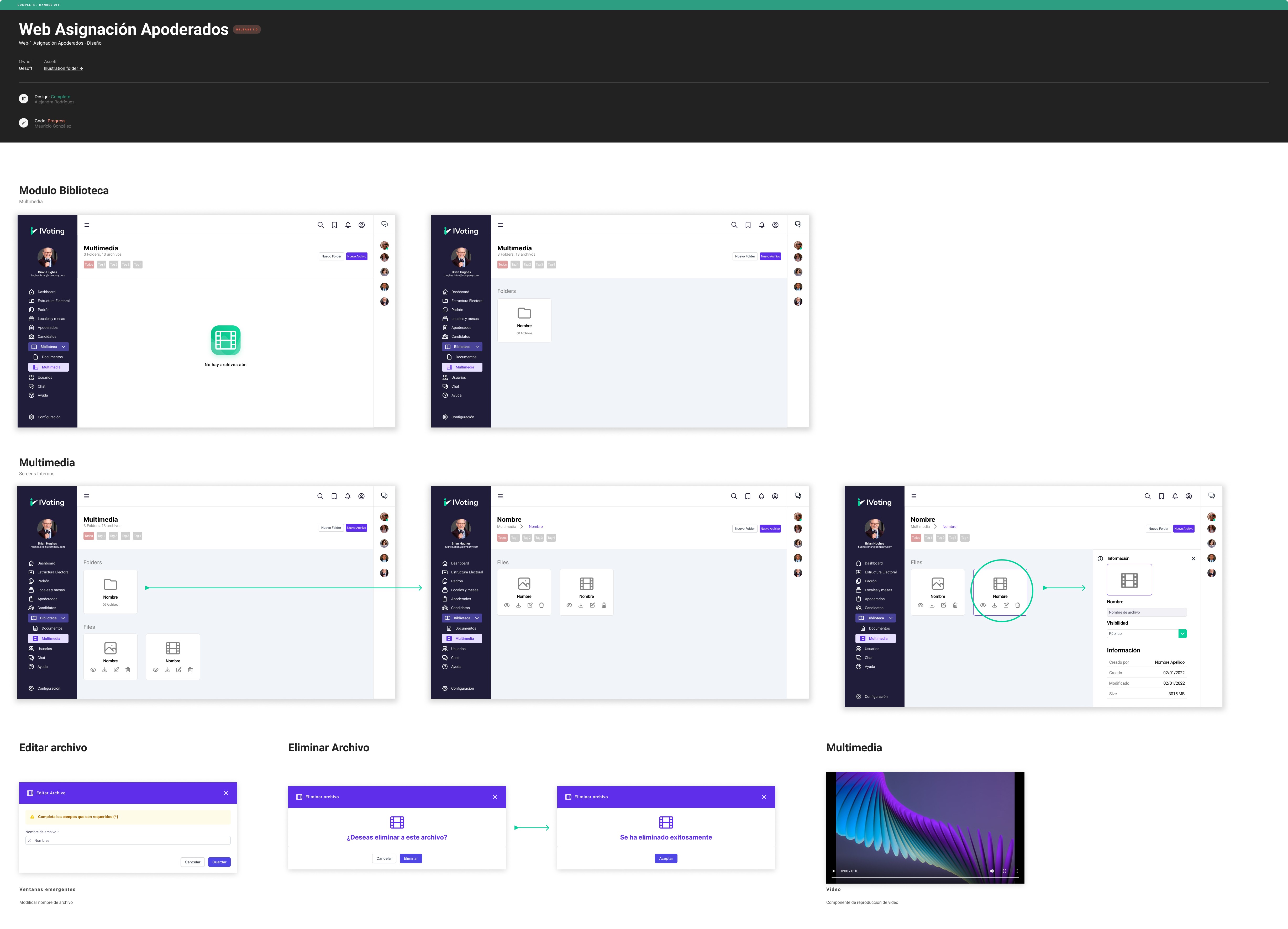
Volunteer Designation Web System
Super Admin Web System
Solution design
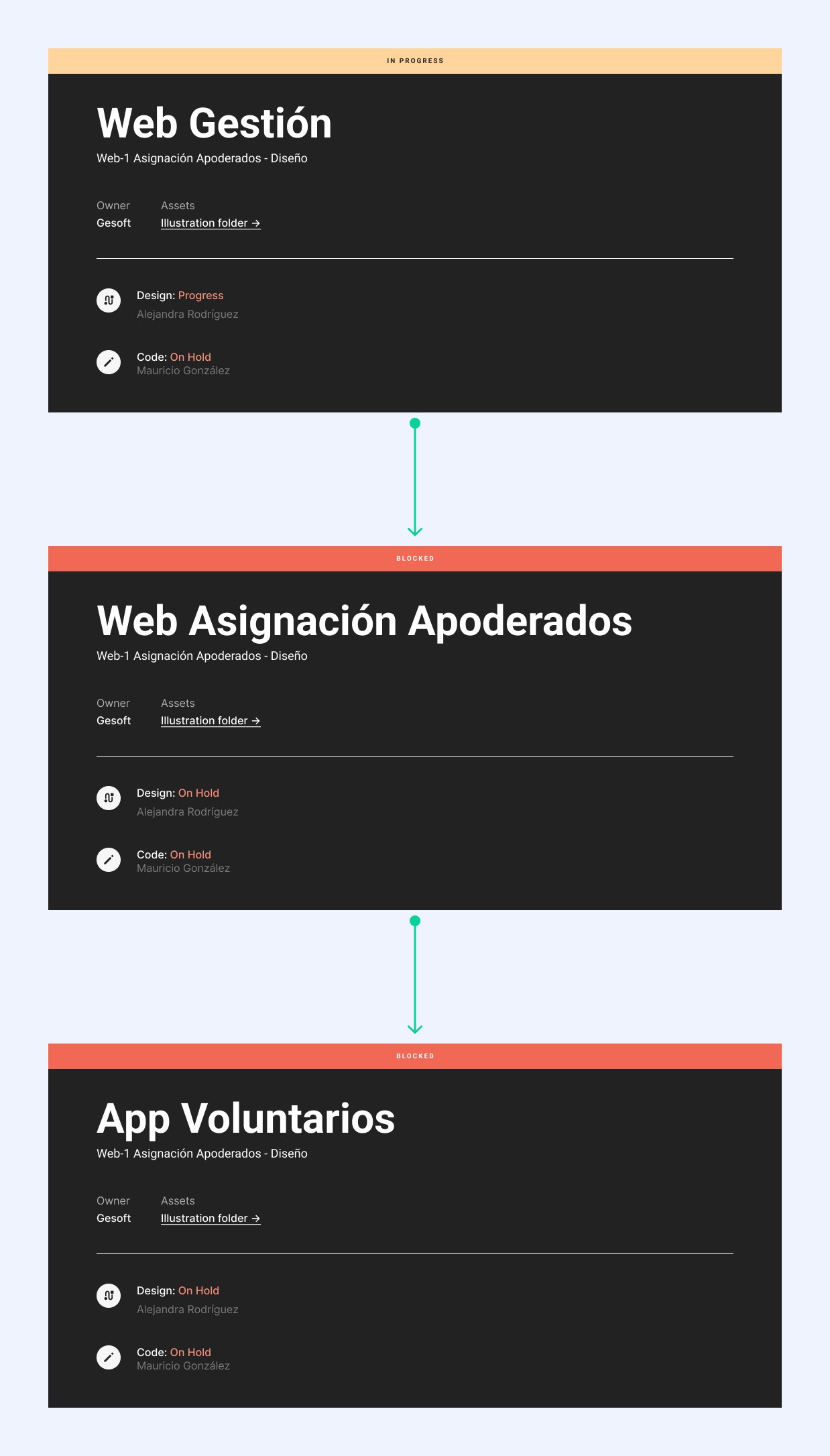
We ran a 5-day design sprint involving the designer (myself), PM, and two developers. During this sprint, we:
Defined the information architecture and navigation flows
Designed two visual approaches (Options 1 & 2)
Built an interactive prototype
Integrated Power BI for real-time political division mapping
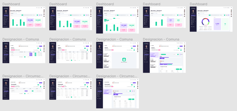
Option 1
Focused on clean, modular card layouts with data-focused graphs.
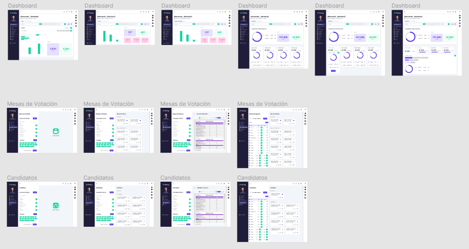
Option 2
Maintained modularity but added tabs, tables, and filters for better information management and reduced cognitive load.
Prototype
To rapidly create a prototype, we cleared our schedules for one week — including myself as the designer, the product manager, and two developers.
During the sprint, we defined the information architecture and navigation flow, and built a semi-functional prototype for usability testing. We focused especially on the integration with Power BI to create an interactive map of Chile’s political divisions.
Usability test
We conducted moderated usability tests with 15 participants (5 per platform). Feedback was analyzed to improve clarity, efficiency, and engagement.
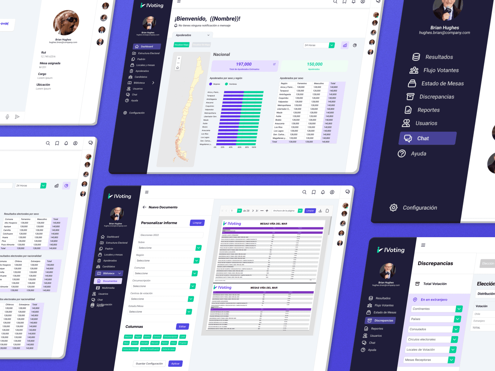
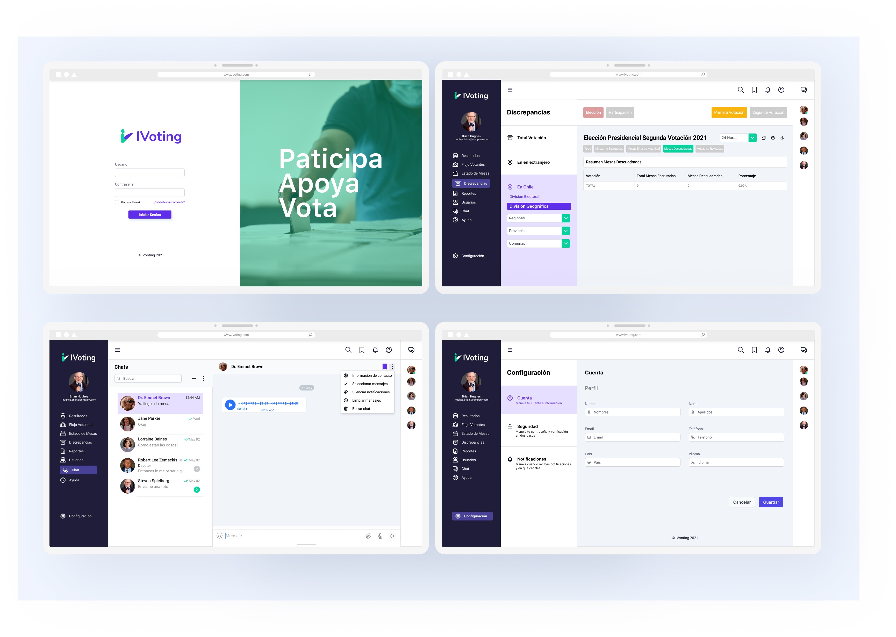
Super Admin Web System
Key insights:
Users appreciated the dashboard but wanted all graphs visible without scrolling.
Requested more chart types and the ability to personalize/export reports.
Volunter Designation Web System
Key insights:
Same dashboard feedback as the admin system.
Suggested adding a Q&A section.
Requested a “Drive-like” document section for training materials
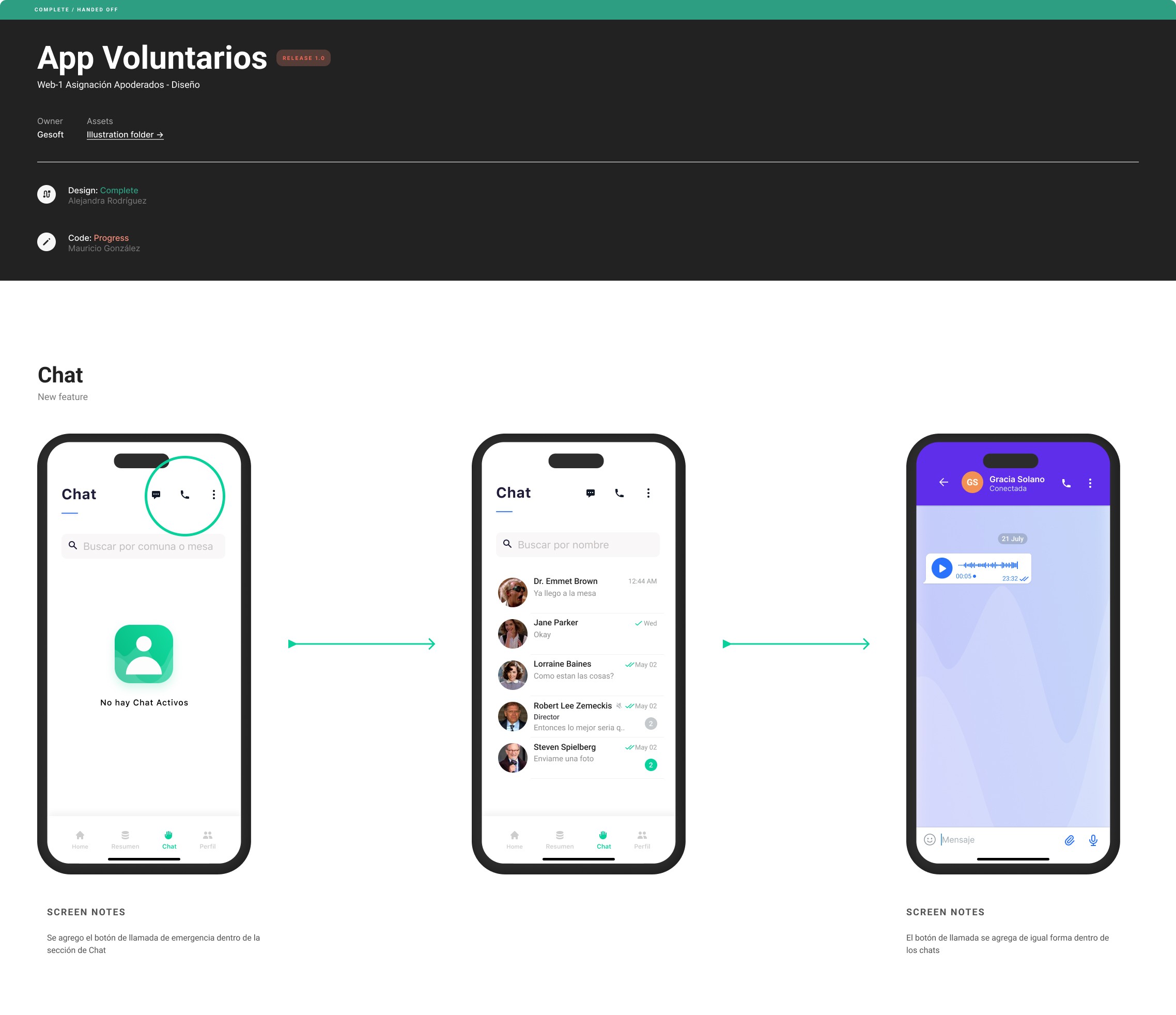
Volunter App
Key insights:
The app was intuitive and well-received.
Volunteers requested a “call” button in the chat for emergencies and faster communication.
Execution
Design System
To accelerate development and maintain consistency, we created a full design system including:
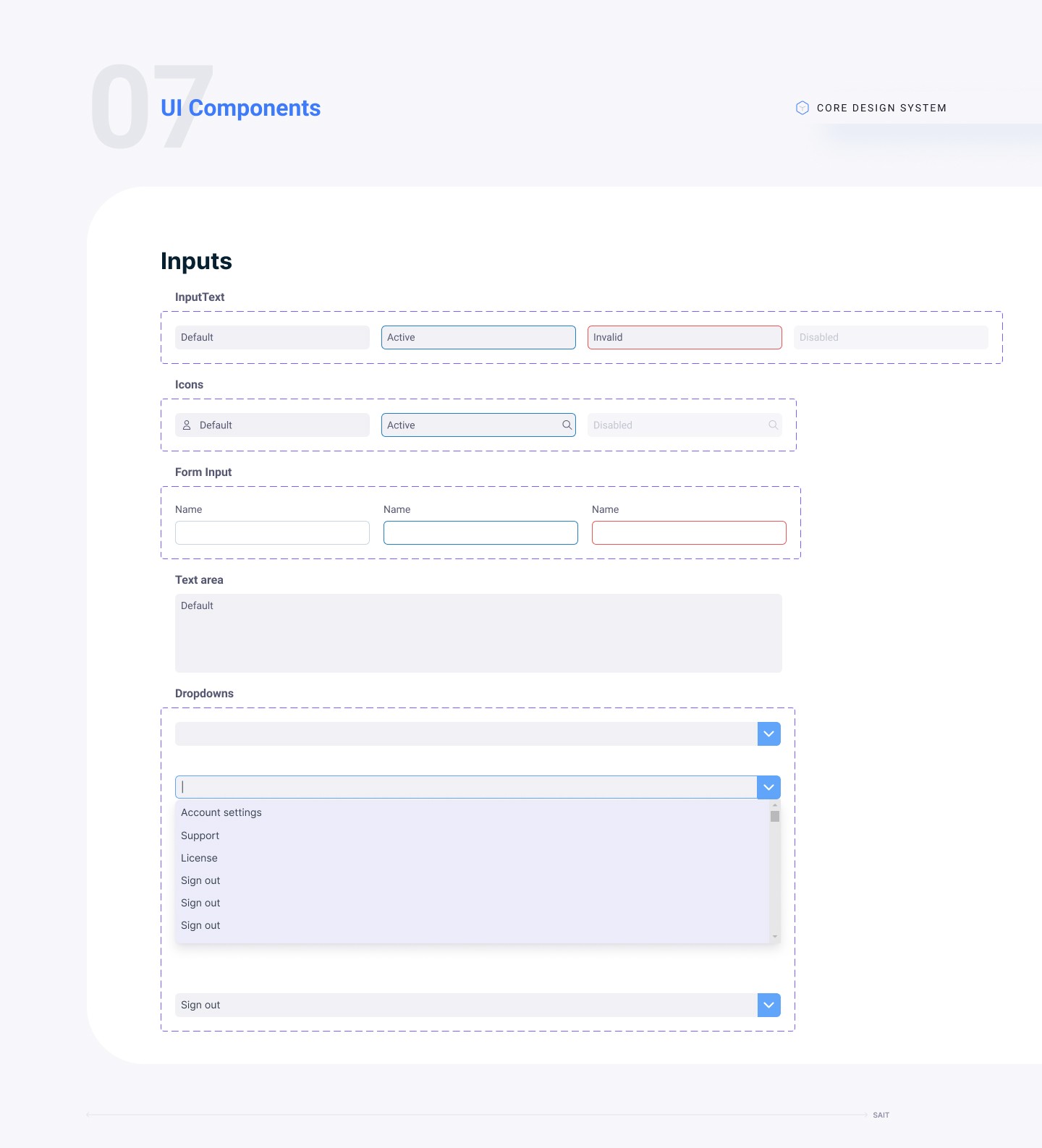
UI Components: buttons, inputs, checkboxes, toggles, cards, tooltips
Iconography
Graph and data visualization templates
Final designs
After incorporating usability feedback and stakeholder reviews, we finalized and approved the product design.
Results & Impact
To measure success, we defined key UX metrics:
Time-on-task for ballot registration
Task success rate
Loading speed for the web system
User error rate
We conducted a live simulation with ~150 users and recorded the following improvement:
Ballot registration time improved by 67% compared to the previous election process.
Key Contributions
Led end-to-end design efforts across 3 platforms
Facilitated workshops with stakeholders and developers
Championed data visualization and dashboard design
Prioritized user-centered design with rigorous usability testing
Delivered a scalable solution for a high-stakes national system